Blue EconOmy
2020 BRANDING & IDENTITY—WEB & Mobile Design
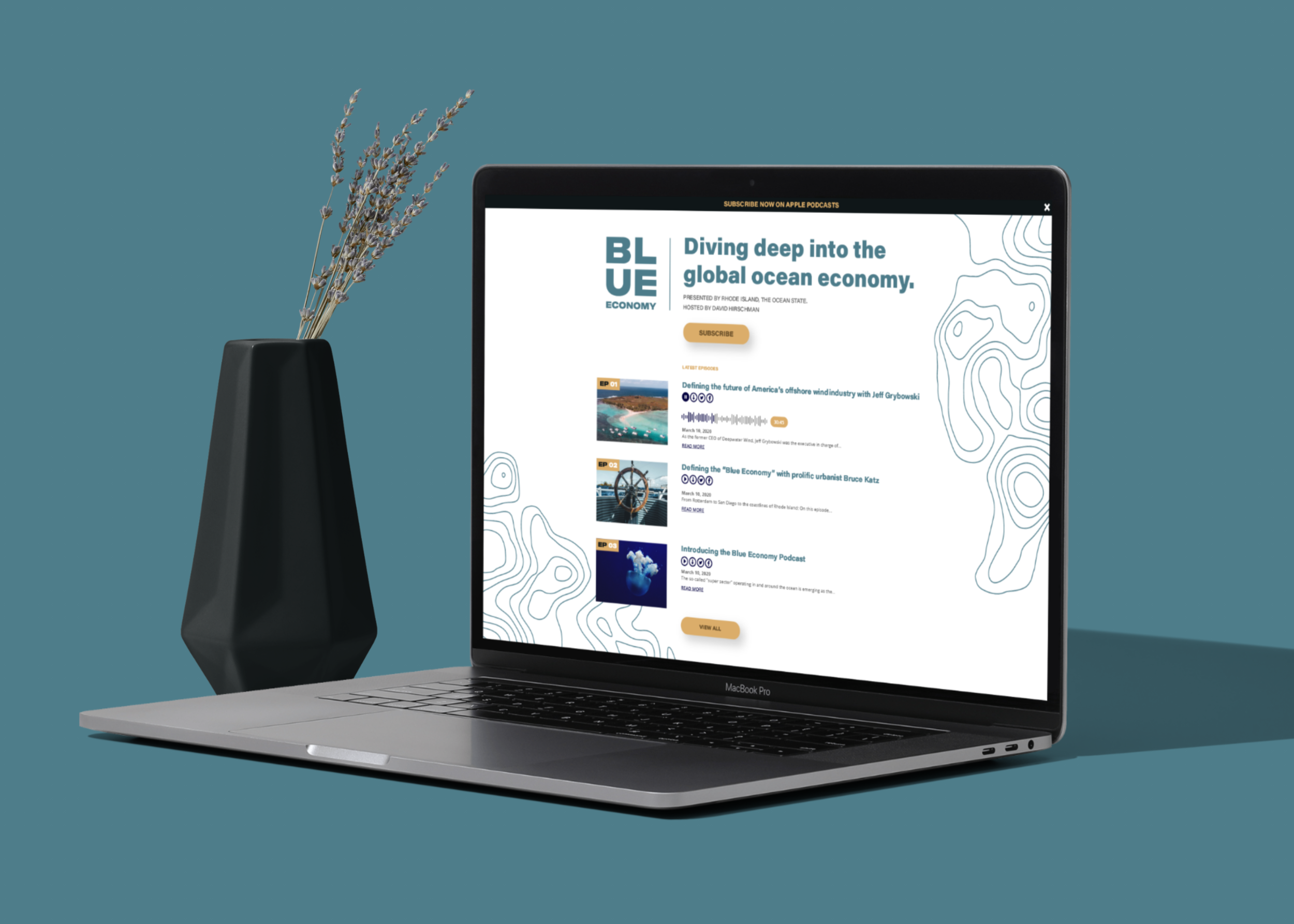
Blue Economy is a podcast platform upon which Rhode Island leaders can join experts from across the country – and world – to share insights and success stories as we continue evolving the global ocean economy.
Approach
Blue Economy presented by Rhode Island Commerce is the first podcast solely dedicated to covering the big-picture happenings of the world’s burgeoning ocean economy.
When they first approached Duffy & Shanley they had no branding. They were seeking guidance on all things related to their brand as they prepared for a public launch. This included recommendations spanning from brand strategy and architecture, to core positioning and messaging, to an identity design spanning both company and products.
As the assigned art director, I knew I needed to create a brand for Blue Economy that embodied their brand attributes of scholarly, cutting-edge, and professional.
“Rhode Island, the Ocean State, is home to America’s first offshore wind farm, the Naval Undersea Warfare Center, the University of Rhode Island’s Graduate School of Oceanography, and hundreds of homegrown maritime companies. Ours is truly a pioneering state in the blue economy space”
—Rhode Island Secretary of Commerce Stefan Pryor
Visual Language
To develop a holistic brand system, we consistently referenced scholarly, cutting-edge, and professional–Blue Economy’s brand attributes–when making decisions about brand elements.
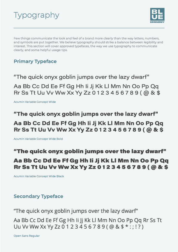
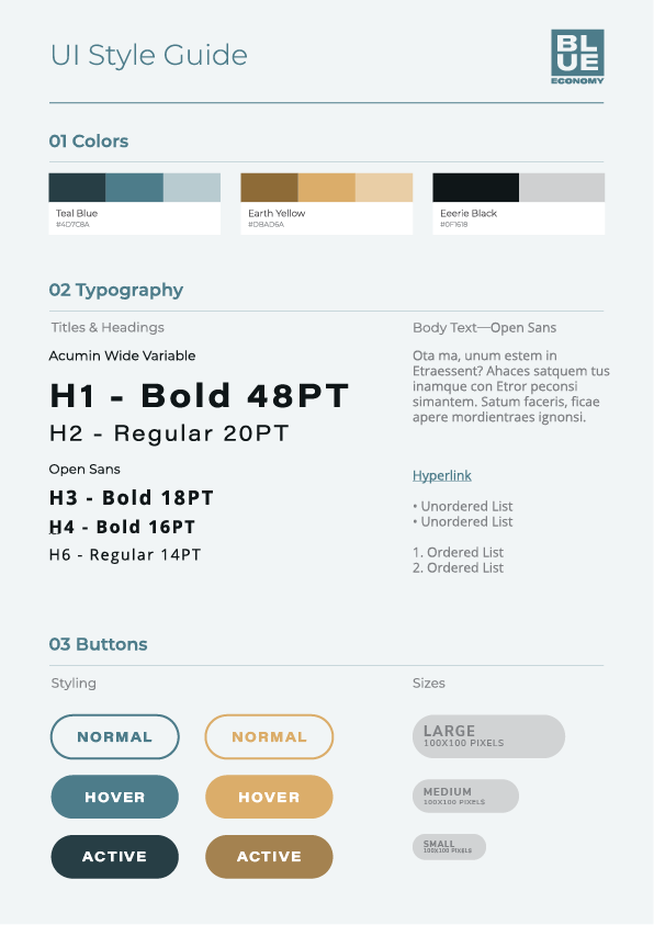
Typography: Acumin supports the brand system by providing a balanced neo-grotesque typeface with an impressive 90 styles. The humanistic Open Sans provides additional texture and a friendly tone in small typographic details.
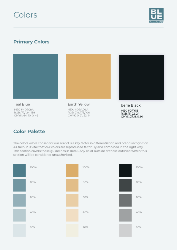
Color: The Blue Economy brand system is primarily muted shades of black, blue, yellow, and grays for a scholarly aesthetic.
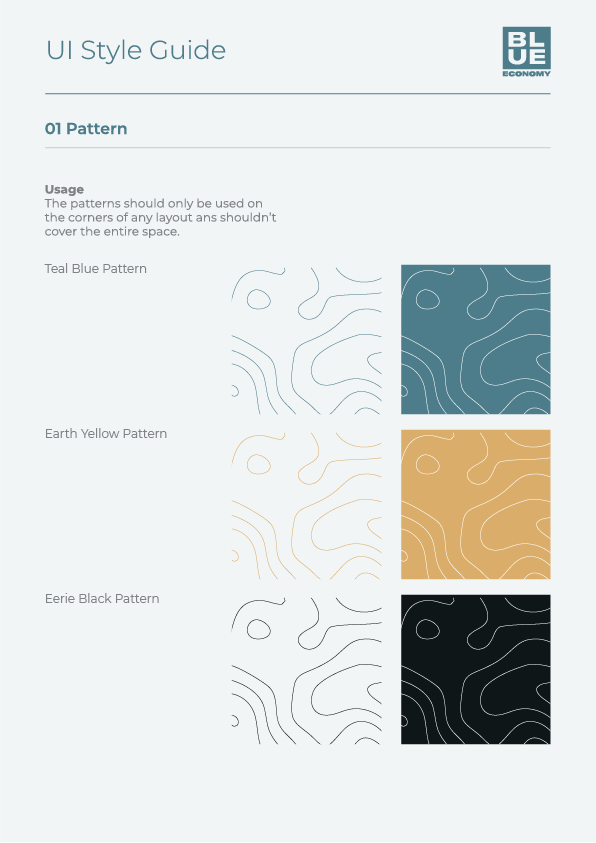
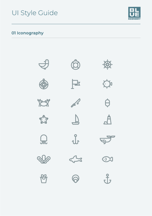
Iconography: The illustration style for Blue Economy consists mainly of a 3px stroke, with very minimal color for a geometric and abstract feel.
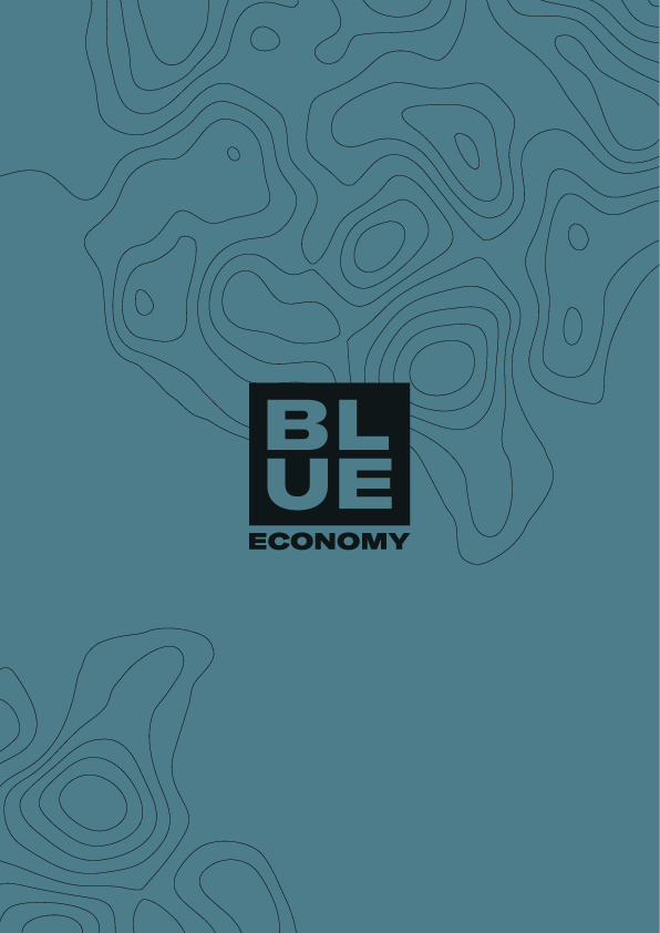

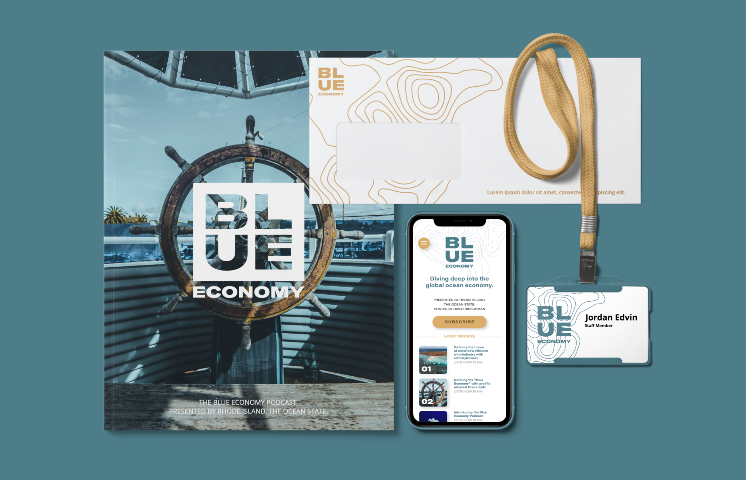
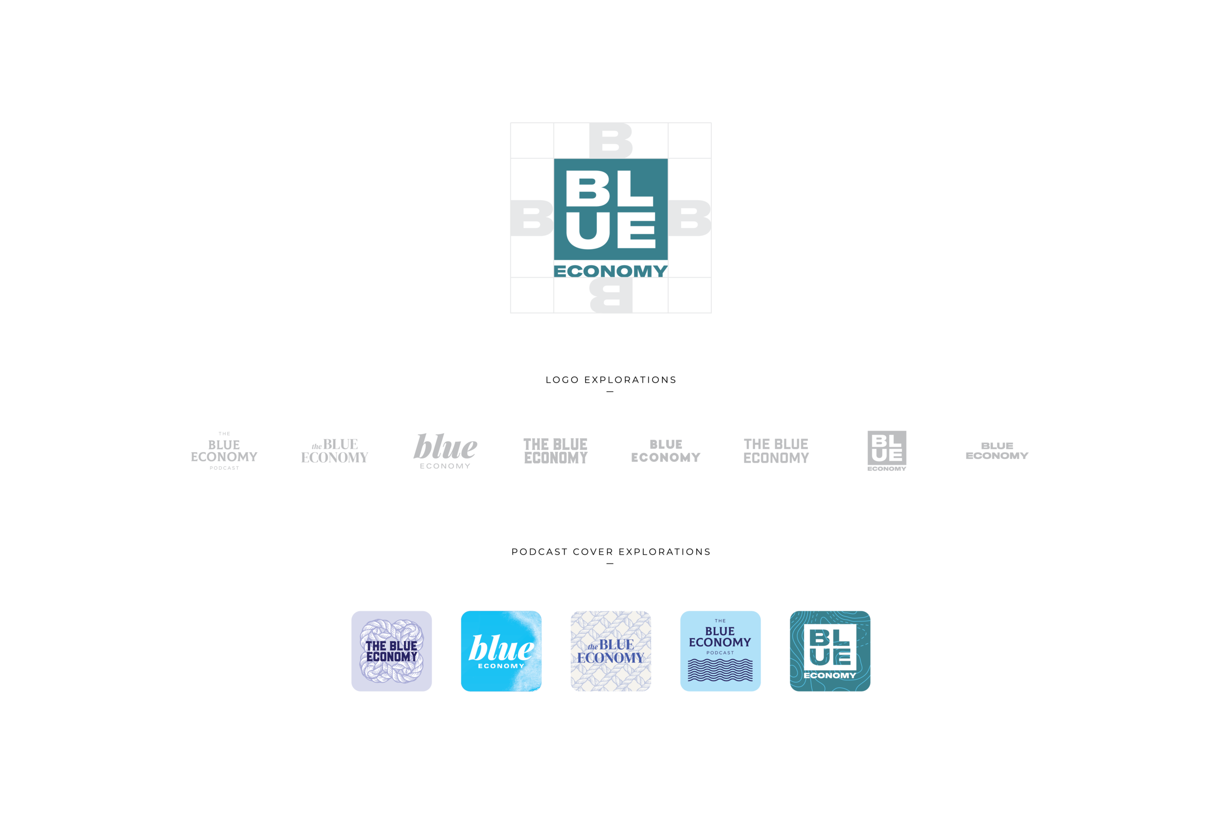
Logomark
Comprised of a diverse range of industries operating in and around the world’s oceans, the “blue economy” is emerging as one of the fastest-growing industry clusters impacting the global economy. To reflect this burgeoning industry, I explored a number of logo options around themes of transformation and progress and ultimately landed on a logo type. The strong geometric nature of the logo type feels timeless yet progressive.
A stacked version of the word ‘BLUE’, signaled Blue Economy’s commitment to modernity. It’s bold and simple in its presentation, but packs a multitude of meanings.
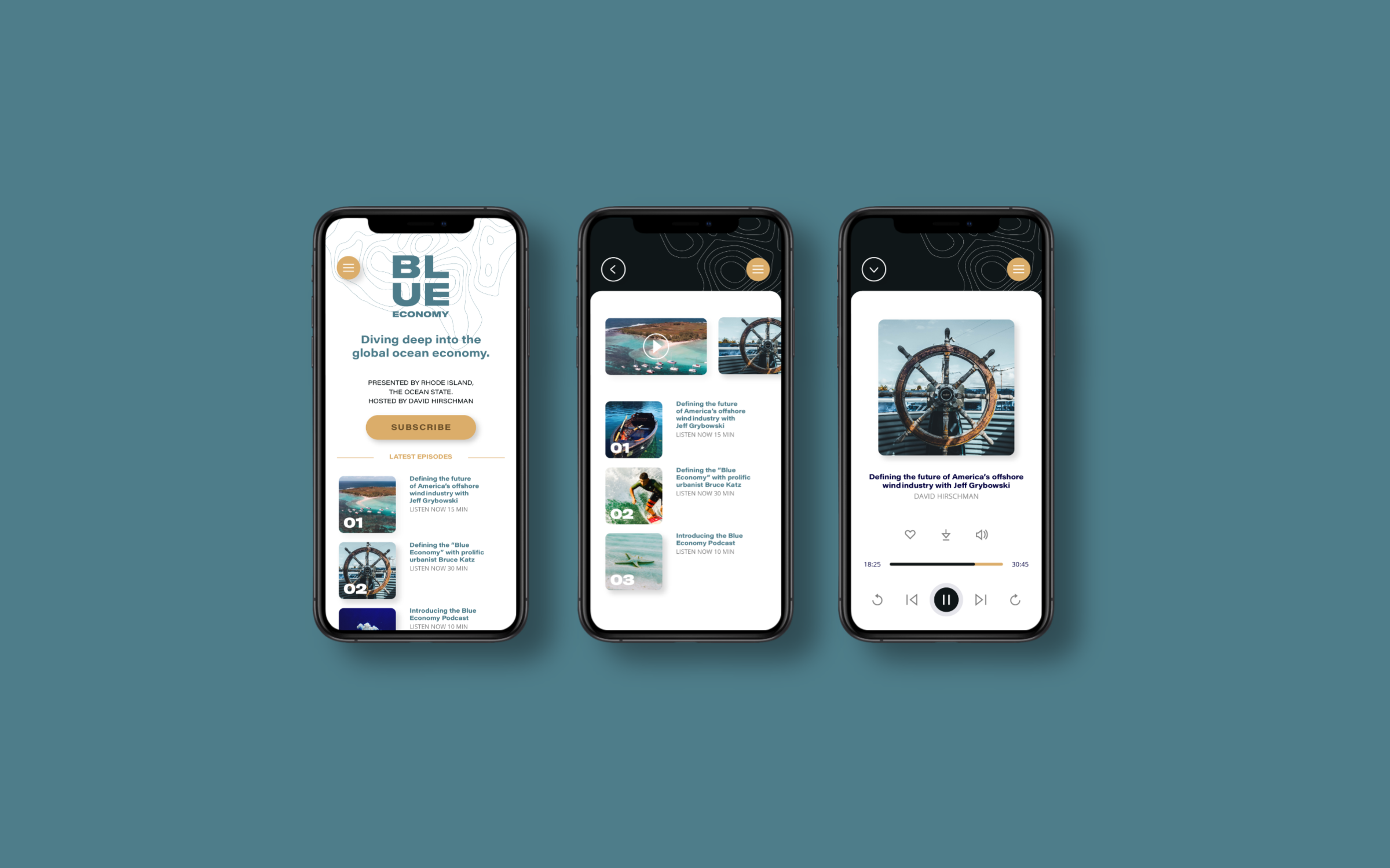
Web & Mobile Design
Sketches, Wireframes,& Testing
With the user’s primary task flows charted out, I began to develop hand-drawn low-fidelity screens to look at a variety of design solutions before moving forward into digitalization.
After selecting a combination of sketched design solutions, I translated these digitally in Sketch, created a clickable prototype with InVision, and user tested with 5 participants. Users revealed two lead susceptibilities in the task flows; 80% of users were unclear of the “Quick Look” call to action and 40% of users felt there were too many pages within the checkout process,
Conclusion
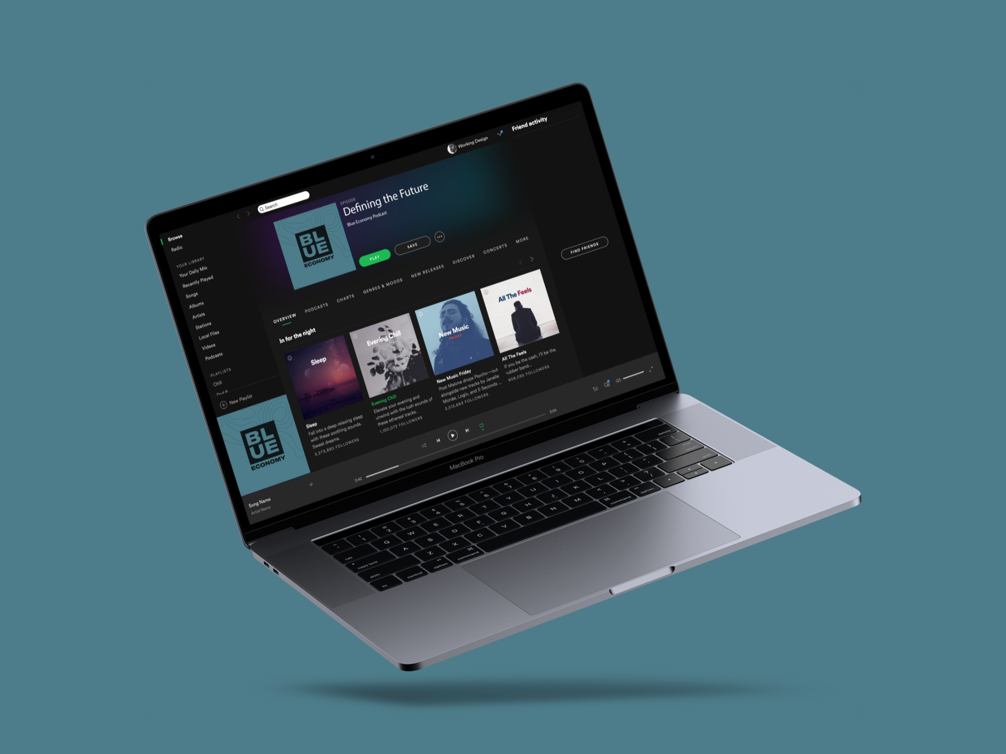
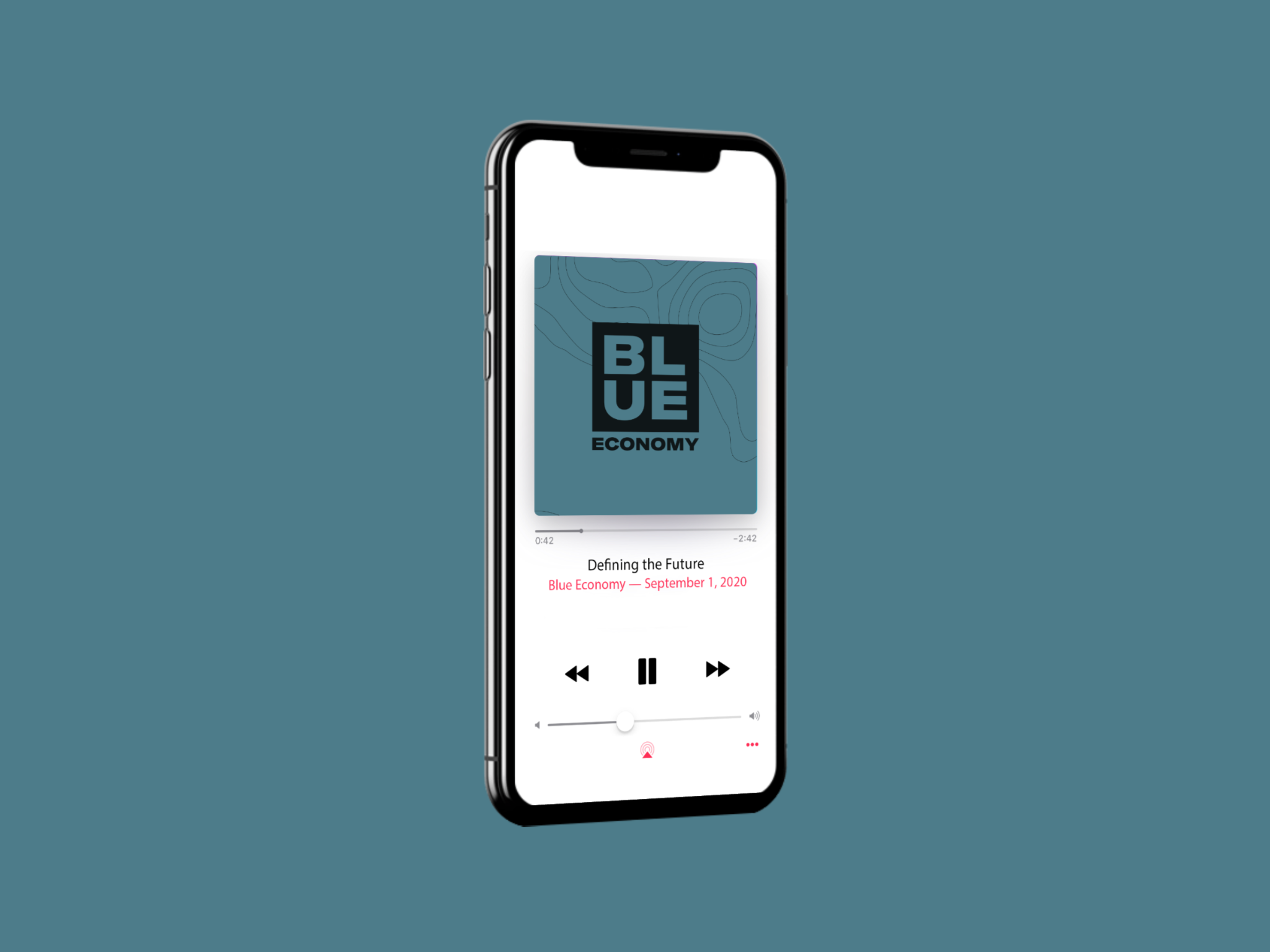
The Blue Economy successfully launched its website and podcast, with viewers tuning in daily to experts and entrepreneurs. It currently has two seasons of episodes available on Spotify, Apple Podcasts, and Google Podcasts with an average rating of 5 stars.